Challenge your assumptions, break out of old habits and discover what’s newly possible with layout on the web.
When the web was first invented, there was no technology for page layout. Every background was grey. Every page was a single column of text, filling the whole space from side to side. Over the years, we’ve created one hack after another to tackle page layout.
The hacks have become far less messy, but everything we do today is still a hack. To hand-code a page layout, you must master the art of clearing floats, using negative margins to rearrange order, and dodging browser quirks. It’s painful. Many of us have given up and instead use a third-party framework; Bootstrap, Foundation, or one of their many competitors let us outsource the pain.
We’ve shipped a lot of work using layout frameworks. We’ve been more efficient and suffered through fewer bugs. But now every website feels the same. Every website reaches for an identical 12-column symmetrical grid. Every site uses the same user experience, shapes and patterns over and over. And we are totally bored.
A new era
But there’s good news. Finally, we are getting real tools for page layout. Instead of hand-coded hair-pulling or boring formulaic frameworks, we can get creative. Flexbox, CSS Shapes, Masks, Clip-path, Initial Letter, Rotation, Multicolumn, Viewport Units, Object-fit and more are already opening up a world of new possibilities.
Most profound of all, CSS Grid Layout will arrive sometime in the next year, completely changing how we approach page layout on the web.
We should start asking ourselves, what kind of page layout will best serve this project?
The question will no longer be ‘which framework should we use?’ We aren’t going to need them any more. In fact, once CSS Grid arrives, using a framework will be much less efficient than hand-coding your own layout in vanilla CSS. Third-party frameworks – even new frameworks based on Flexbox or Grid – will just get in the way.
We should start asking ourselves, what kind of page layout will best serve this project? How can we tap into a hundred years of graphic design practice to communicate through our layout?
Fighting the code will no longer be the hardest part of creating a layout. Our biggest challenge will be fighting the limitations of our imagination. We developed powerful habits over the last 10 years. We squashed our creative ideas under piles of ‘the web doesn’t work that way’ and ‘you can’t do that’. Well, things have shifted. The boundaries between possible and impossible have drastically changed. It’s time to let go of long-held habits and myths.

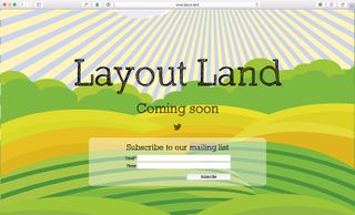
layout.land will become home to a community of designers trying out different layouts
Myth 1: Everything must be a floating bar of soap
Any float-based web page layout is like a bathtub full of hundreds of bars of soap. Every element on the page is a rectangle, fighting to rise up to the top. The header is a bar at the top, followed by a bar of navigation, followed by a hero bar, a sidebar, a bar of content. Any time the viewport is resized and a different media query kicks in, the soap bars rearrange themselves, jostling for a position on top.
Floats don’t allow for white space. Floats encourage busy pages crammed full of crowded content. Floats require us to artificially create content of the same length or aspect ratio.
Although it still works on the basis of a grid of columns, CSS Grid has a different mental model to the layout frameworks we’ve been using. One of the biggest changes: it has rows. Rows! These allow us to line things up horizontally, but also let us distribute vertical space. Rows let us create white space. Our default will no longer be everything crammed up against the top of the page.
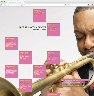
There are ideas from a century of magazine design that become possible when we have the ability to control the space vertically. I’ve been collecting books on grid and layout design. In one of them, I saw a poster for the Lincoln Center’s 2007 Jazz Festival and wondered if the design could be accomplished as a web page: Figure 1 shows the result.

CSS Grid lets us place things in vertical space, instead of cramming everything against the top of the page
Myth 2: Rectangles; only rectangles
By default, everything on a web page starts life as a rectangle. The tools we’ve been using keep it that way – we line up one box after another. Box. Box. Box.
Now we have tools to help us break up the boxes. You can use Clip-path, Masks or Gradients to cut a box into a different shape. Triangles, diamonds, trapezoids – content can be cut into all sorts of silhouettes. Create a headline with a bold background colour, and slice across the bottom of that box with a diagonal line. Take a series of bio photos and cut them all into hexagons.
CSS Shapes lets you float an element to one side, and flow the content that follows in a shape that’s not a rectangle. Float a photo that’s been cut into a circle with border-radius , and then flow the accompanying text in a circular shape around the photo using shape-outside .
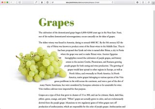
Or create a complex illustration with lots of odd shapes, and use that image as a mask to get the browser to flow text around the shapes in the illustration. In Figure 2, a photo of grapes is floated left, while the text flows around a polygon.
With Rotation you can escape the perfection of everything being square to the page. Tip a headline a bit askew. Tilt a photo to give it some character. Put the credit for a photo sideways along the edge.

The photo is floated left, while the text flows around it in a non-rectangular shape
Myth 3: We can’t control the fold
With viewport units, we can size or place items in relation to the viewport.
If we want to style an item so it’s a certain proportion of the viewport, we can. img {height: 50vh; width: 50vw} will size an image so it fills exactly half the viewport in each direction.
In the past, defining both a height and a width for an image was a terrible idea. The image would end up being squished. But now, object-fit: cover tells the browser to maintain the aspect ratio of the image, and crop it to fit the defined box.
Figure 3 shows an example. No matter the size of the browser window, the photo of Grace Hopper is always half the width and all of the height. Start scrolling and the article appears just ‘below the fold’. This layout is accomplished with Viewport Units and Flexbox.

Myth 4: 12 columns is best
It was in 2006 that the industry started advocating for the use of a 12-column symmetrical grid. We didn’t intend to become prescriptive, we just wanted simpler maths for hand-coding our fixed-width websites.
960 pixels fitted nicely inside a 1024px-wide screen and allowed us to create column units of 60px with gutters of 20px. Plus, having 12 columns meant we could easily break the space in half, thirds or quarters.
Starting new projects with a Visio template made UX design seem more legitimate. It was easier to impose a standard on a team when you could point to a popular website and say ‘everyone is using this tool, we should do this’. We needed to tame the chaos. But after 10 years of almost every site using the same grid, web design has become incredibly boring.
The 12-column symmetrical grid conveys a feeling of stability and sturdiness, and we use it without asking if that’s really the feeling we want to convey. We’ve learned to art-direct through our choice of typefaces, but not yet through our layouts.
With responsive web design there is no reason to maintain mathematical ratios based on a 960 grid. For years, Mark Boulton has been advocating the idea of using odd numbers of columns, like nine or 11, and trying out grids where the columns are not all the same size, but instead are based on a ratio like the golden ratio.
Such grids are the staple of great graphic design in print. Creating custom grids would allow us to convey so much more about each project through its design, but somehow these ideas have not taken off.
Why not? I think it’s because the maths is too hard when the underlying technology is the float. The team at Mark Boulton Design created an app called Gridset to make such design work easier, and the Sass community has built one library after another to abstract away the maths of complex grids, but either way it all still feels too tricky and fragile.
CSS Grid will make designing custom grids trivial. It will be just as easy to create 11 columns as it is 12. It will be a piece of cake to create a ratio-based array. The browser will handle most of the maths, we just have to get creative with what we want to do.
There’s no reason to keep to 12 columns. Do something new and give your site a fresh look. We’ve got decades of graphic design practice to guide us.

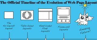
A brief look at how layouts have evolved; we are at the beginning of a new era in web design
Myth 5: We have to use a layout framework
Actually, writing CSS using the new Grid syntax will be easier than applying a framework, and updating old-style frameworks with CSS Grid will only make life harder. Get out of the habit of reaching for a framework. Write your own vanilla CSS.
Myth 6: We are stuck in a rut because of RWD
I don’t believe that for a minute. It was hard for the industry to wrap its head around responsive web design, so we leaned on tools to help us relaunch our sites quickly. But there’s nothing inherent to RWD that requires we all use the same half-dozen layout patterns.
We can create anything we want with CSS, and change it to whatever we want to at any breakpoint. Stop using cookie-cutter tools and you won’t have cookie-cutter results.
Here’s a taste of the surprising waiting in CSS Grid: it can rearrange the order of the content to make it fit the available space using the grid-auto-flow: dense; property. Figure 4 shows the result.

Apply grid-auto-flow: dense and the browser rearranges the order of content to make it fit
Letting go
If you can let go of these myths, your work will stand out. You can make a splash and have a strong impact. Take advantage while the opportunity is still new. Start playing with these properties and see what’s possible.


